Product DesignUX StrategyFintech

Revolut

Enhancing Saving Goal Tracking in Pockets

Revolut helps millions manage money, but its savings experience doesn't clearly communicate progress or priorities.

Role

Product designer

Timeline

2 months

Contribution

Research, UX strategy, interaction design and usability testing

Mentor

Marzi Nadali

0
Personal customers globally
0
Countries & regions supported
0
Finance app in 19 European countries
0
Net profit before tax
0
Customers are millennials or Gen Z
Problem statement

Revolut lets users set up "Pockets" for saving toward specific goals, but many find it hard to visualize their progress or stay motivated over time. The current interface offers only a static percentage bar and lacks interactive features, personalized nudges, or milestone celebrations. Users managing multiple goals, vacation fund, emergency fund, gadget purchase, often feel overwhelmed and lose track of priorities.

Every persona reaches the same dead end: a number with no meaning and no next step.

01 · Trigger

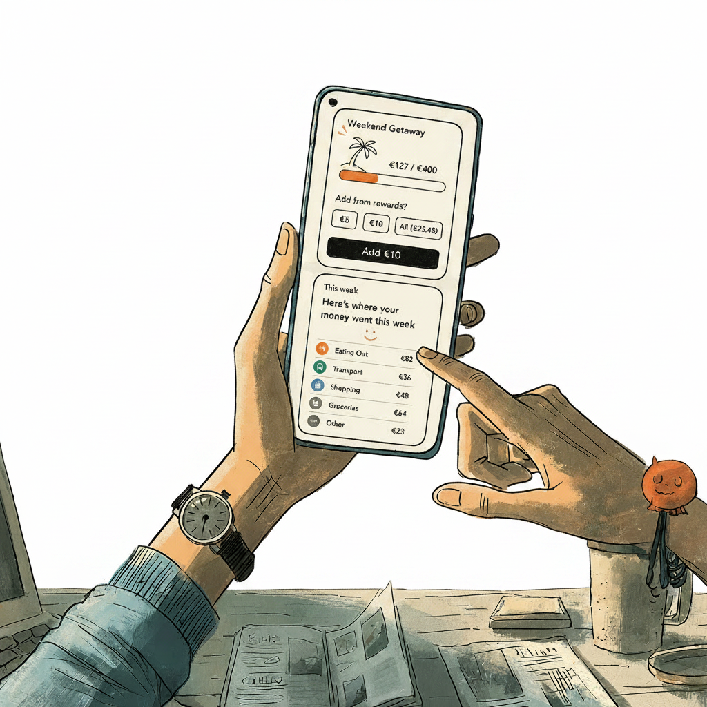
Friday 8:30. Elena opens Revolut on the tram to see "how much damage" she did this week.

02 · Open app

Instead of rigid budgets, she wants a calm, friendly overview of where her money went.
03 · Check spending

A highlight shows the cashback and rewards she's earned, "turn this into progress?"

04 · Decide

She taps the prompt and sees her savings goal filling up, nudged to move a little across.

05 · Reassure

Later she makes a spontaneous purchase; Revolut categorizes it and reassures her she's still within her usual pattern.

06 · Reflect

That evening a guilt-free reflection screen shows categories, rewards earned, and how much closer she is thanks to tiny auto-saves.

07 · Celebrate

A short celebratory message reframes it: "You enjoyed your week and still moved closer to Weekend Getaway, nice balance!"

08 · In control

She closes the app feeling informed and in control, open to Revolut nudging small, painless savings in the background.
Users lose motivation because progress is unclear and multiple goals are hard to prioritize.

People create several Pockets, but the interface gives them little help in understanding progress or deciding which goal to fund first. As a result, savings goals can feel flat, and users lose momentum before reaching them.

1See progress
2Feel closer
3Add money
4Reach milestone

See progress

Motivation rises the closer people feel to a goal. It starts with being able to see, at a glance, exactly where each Pocket stands.

"I have a holiday pocket, an emergency pocket and a car pocket. I forget which one I'm meant to be feeding.", Research participant, managing multiple Pockets

Interface issues break motivation by hiding goal progress and making saving actions hard to decide.

These four heuristics are most directly connected to our problem statement and observed user pain points, allowing a focused, in-depth analysis of the most critical usability issues in Revolut.

User task

Manage multiple saving goals and decide what action to take next from the Home screen.
H1Visibility of system status
H2Match with the real world
H6Recognition rather than recall
H9Help users recover from errors
Must fix before release High priority fix Low priority fix
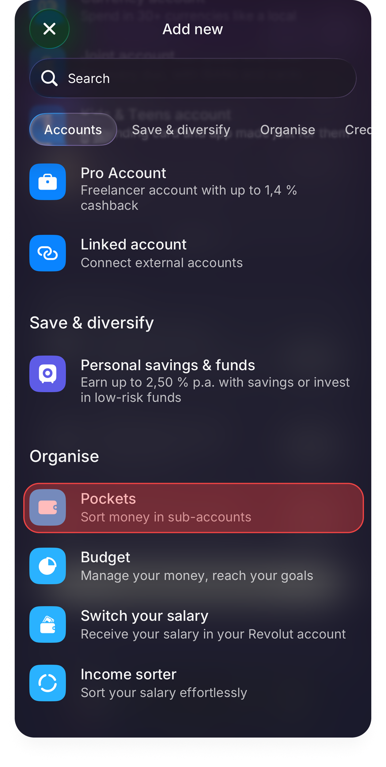
Add new, Pockets buried in the list
Severity 3 · H1 Visibility of system status

Pockets are hard to discover from Home

Pockets appear as an extra product rather than a core goal-management space. Buried under Savings & Funds and Brokerage, they get less attention and repeat-use decreases.

RecommendationSurface active Pockets on Home as goal cards, not only inside "Discover more". Treat saving goals as a primary feature, not an upsell product.
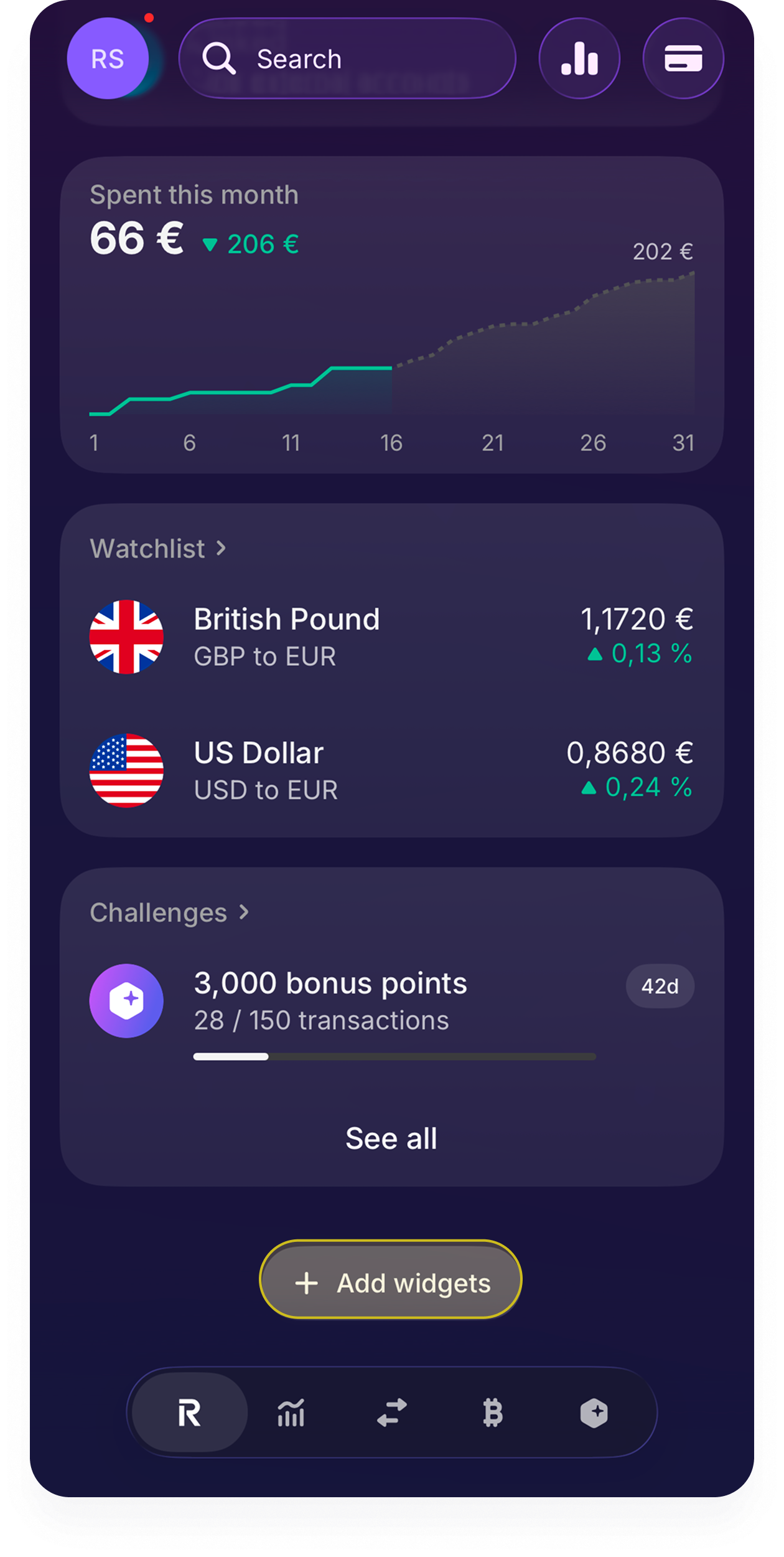
Dashboard with no goals overview
Severity 4 · H6 Recognition rather than recall

No overview of multiple goals

Users with vacation, emergency and gadget Pockets need an overview instead of remembering progress across screens, otherwise they lose momentum deciding what to fund first.

RecommendationAdd a Goals widget: show top 3 Pockets with priority, progress, status, and one suggested action, visible directly from Home.

Consistency creates the greatest friction

We grouped the findings into eight usability dimensions and compared their average severity. The strongest gaps sit in consistency, user control, functionality and simplicity, showing that the main problem is a fragmented goal-management experience.

Higher values indicate greater impact on managing multiple saving goals.

From passive money storage to active financial guidance.

0
Participants
0
Core themes
0
Opportunities

Who we spoke to

Eight participants across the spectrum of financial confidence, from cash-first users to advanced optimizers. There is no single "saving user".

A

Ana

Trust-sensitive goal separator

Creates manual categories but avoids official Saving because it feels unclear.

M

Mike

Advanced optimizer

Understands Saving but prefers better investment options.

S

Sara

Careful student

Tight budget; small purchases add up. Needs control and clarity.

E

Elena

Free-spending professional

High income, low structure. Wants awareness without restriction.

M

Mina

Cash-first, low confidence

Uses cash and memory; understands only simple visuals.

L

Leila

On-the-edge switcher

Uses Revolut partly, compares with Emma. Motivated by cashback and interest.

K

Klara

Progress-seeking pocket user

Wants progress, prediction, and suggestions inside Pockets.

A

Amir

Active pocket budgeter

Uses Pockets seriously but still can't easily see progress or momentum.

The key themes

The four patterns that appeared most consistently across the eight interviews.

01People manage money by purpose, not just by balance+

Users don't only ask "how much do I have?", they ask "what is this money for?", "can I safely spend this?", and "will this affect my goal?" Pockets should be built around purpose and decisions.

02Balance alone doesn't communicate progress+

A balance tells users what exists now, not whether they're succeeding. They want to know if they're ahead or behind, saving faster or slower than last month, and when they'll reach the goal.

03Users want quick answers, not complex dashboards+

Most participants don't want to interpret analytics. They need Revolut to translate financial data into plain-language answers to the questions they actually ask.

04Users need flexible motivation, not guilt or restriction+

Not everyone responds to strict budgeting. Users want support that helps them decide better, without feeling promised, restricted or judged. The tone should be supportive, not controlling.

Three ways of saving, but all three get stuck at the same question: am I actually getting closer?

Maya

Maya

29 · The Goal Chaser
"I can see my balance. I just can't tell if I'm actually getting closer to my goal."

Splits her salary into Pockets the day she's paid and checks in monthly to see whether she's saving faster or slower than before.

Goal: See real progress, pace, and a completion date, not just a balance.
Pain points
  • Pockets show a number, but not whether she's ahead or behind.
  • She has to do the maths herself to know when she'll hit a goal.
Sara

Sara

22 · The Careful Budgeter
"The small things, coffee, eating out, add up before I even notice it."

Lives on a tight student budget. Protects rent and food first, and wants control over spending without feeling stressed or judged.

Goal: Stay in control on a tight budget with simple, clear visuals.
Pain points
  • Small repeated purchases go unnoticed until they've added up.
  • Too many numbers and unclear labels feel overwhelming.
Elena

Elena

34 · The Free Spender
"I want to know where my money goes, but I don't want to feel guilty about it."

High income, low structure. Happy to spend, but responds to gentle nudges; cashback and rewards make saving feel rewarding, not restrictive.

Goal: Stay aware of spending and be nudged to save, without guilt.
Pain points
  • Rigid budgets feel like restriction, so she disengages.
  • Nothing connects her rewards to an actual saving goal.

Leading saving apps show progress, predict timelines, and celebrate milestones, Revolut does none of these.

I reviewed five direct and indirect competitors in the saving and budgeting space, Monzo, Starling, N26, Plum and YNAB.

MonzoDirect · UK

Saving feels easier when it's playful and part of everyday banking.

Pots, Trends, round-ups and Salary Sorter make budgeting feel light.

Revolut opportunity

Add more emotional progress moments inside Pockets, not just static numbers.

StarlingDirect · UK

Clear money separation builds trust.

Spaces are easy to understand and keep money separate from the main balance.

Revolut opportunity

Make Pockets more visible and easier to access from Home.

N26Direct · EU

Flexible sub-accounts help users manage multiple priorities.

Up to 10 Spaces, shared Spaces, cards/IBANs and Income Sorter support organisation.

Revolut opportunity

Give users an overview of multiple Pockets with priority and status labels.

PlumIndirect · UK/EU

Automation reduces effort.

Round-ups, saving rules, challenges and smart suggestions help money grow passively.

Revolut opportunity

Suggest small, affordable actions: "Save €10 this week" to stay on track.

YNABIndirect · UK/EU

Users need clarity about what their money is for.

Every dollar has a job. Goals are prioritised and decisions are intentional.

Revolut opportunity

Help users understand whether they're ahead, behind, or affecting another goal.

Three different savers, three habits, all leave the app unsure if they're on track.

The Goal Chaser

The features that matter most show users where they stand and what to do next.

Plotted by impact (higher = more valuable) against effort (higher = more to build). Hover a quadrant to focus it.

Impact ↑Effort → Low effort, High impact High impact, High effort Low impact, Low effort High effort, Low impact
Replace the flat % bar with a richer visual of how much is saved and how much remains One summary screen showing all Pockets side by side, sorted by urgency or deadline Show the projected date a user reaches their goal at their current saving rate Surface one clear contextual action per Pocket, always know what to do next Show whether each Pocket is ahead, on track, or behind its pace A brief first-Pocket guide explaining how it differs from a Flexible Account
Ask what / by when / how much, then calculate the required pace automatically Suggest a weekly saving amount from spending patterns and available balance Detect slow saving and nudge with how much to add to get back on track Connect spending to goals, "cut dining by €20 to reach your goal a month earlier" In-app celebration at 25%, 50%, 75% and 100% of a goal A rewarding moment at 100% before prompting the next goal
Temporarily pause a Pocket's contributions during a hard month without closing it Suggest a weekly contribution that hits the chosen deadline Update target or deadline anytime without losing existing progress Pin the most important saving goal to the top of the list A simple growth chart inside each Pocket A short personal note inside a Pocket, why they're saving
Shared goals: multiple users contribute and see each other's progress Archive a completed Pocket without deleting it Share saving progress with friends and comment on each other's goals Attach a personal photo to a Pocket to make the goal feel tangible A streak counter for consecutive weeks of contributions
The solution

From passive money storage to an active saving coach.

Instead of only showing how much is saved, the redesigned experience helps users build a realistic plan, understand where they stand, recover when they fall behind, and stay motivated along the way.

01

Know exactly how much to save

Users defined what they were saving for, the target amount, and the deadline. The app calculated the optimal weekly contribution instantly, surfaced slower and faster plans, and showed the impact of each choice before confirmation.

High effort · High impact
02

Catch up before you fall behind

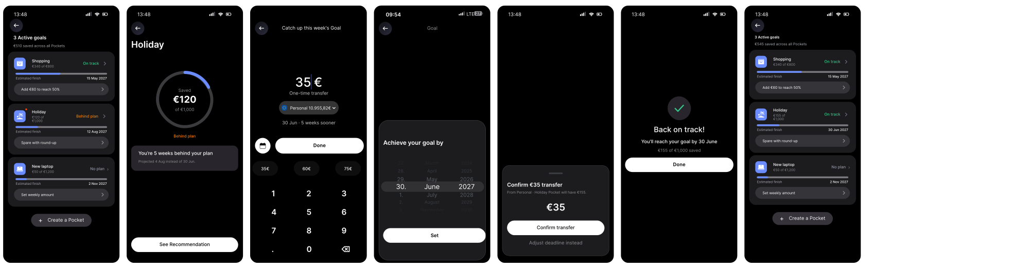
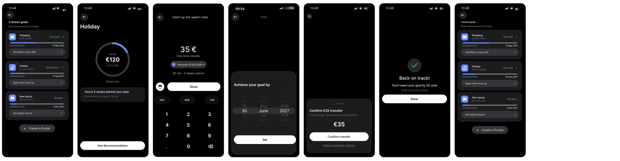
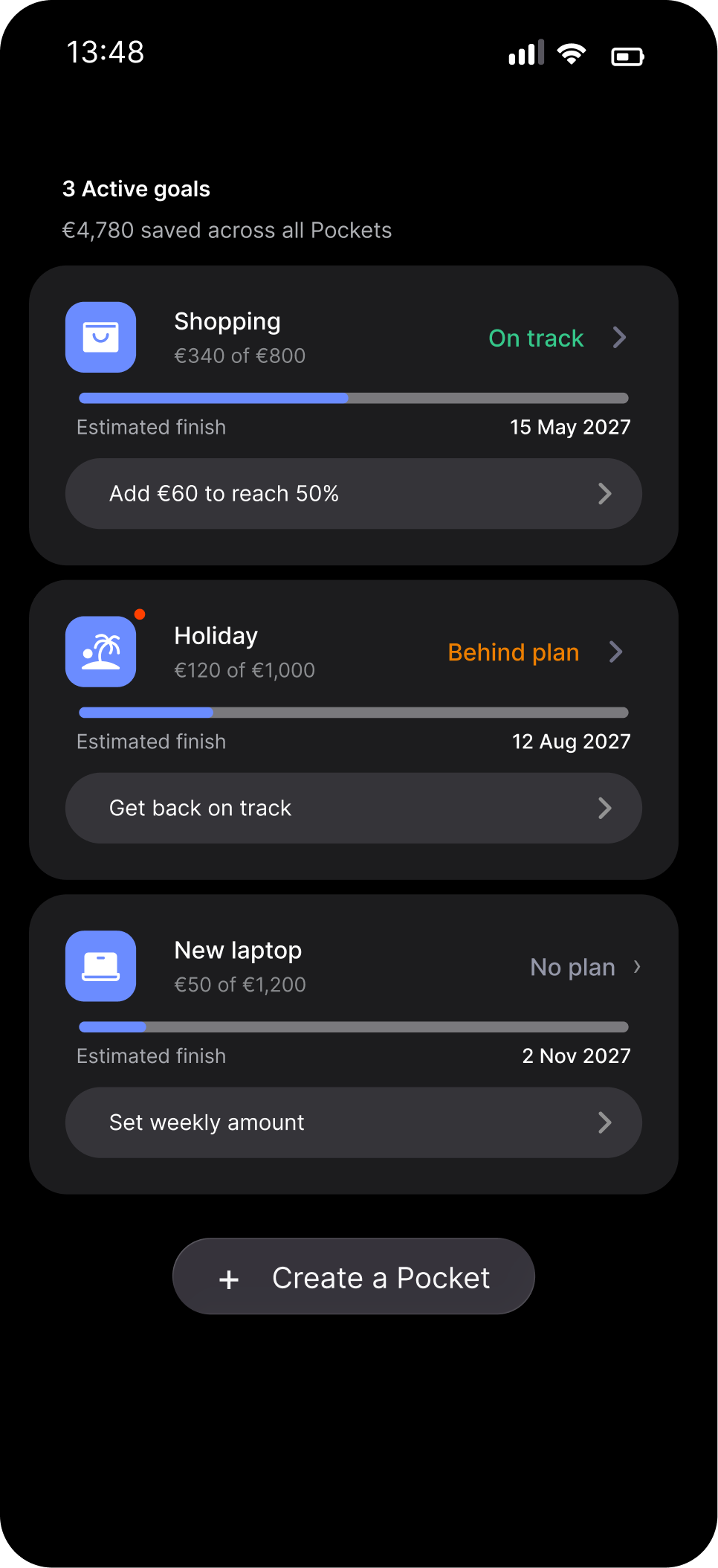
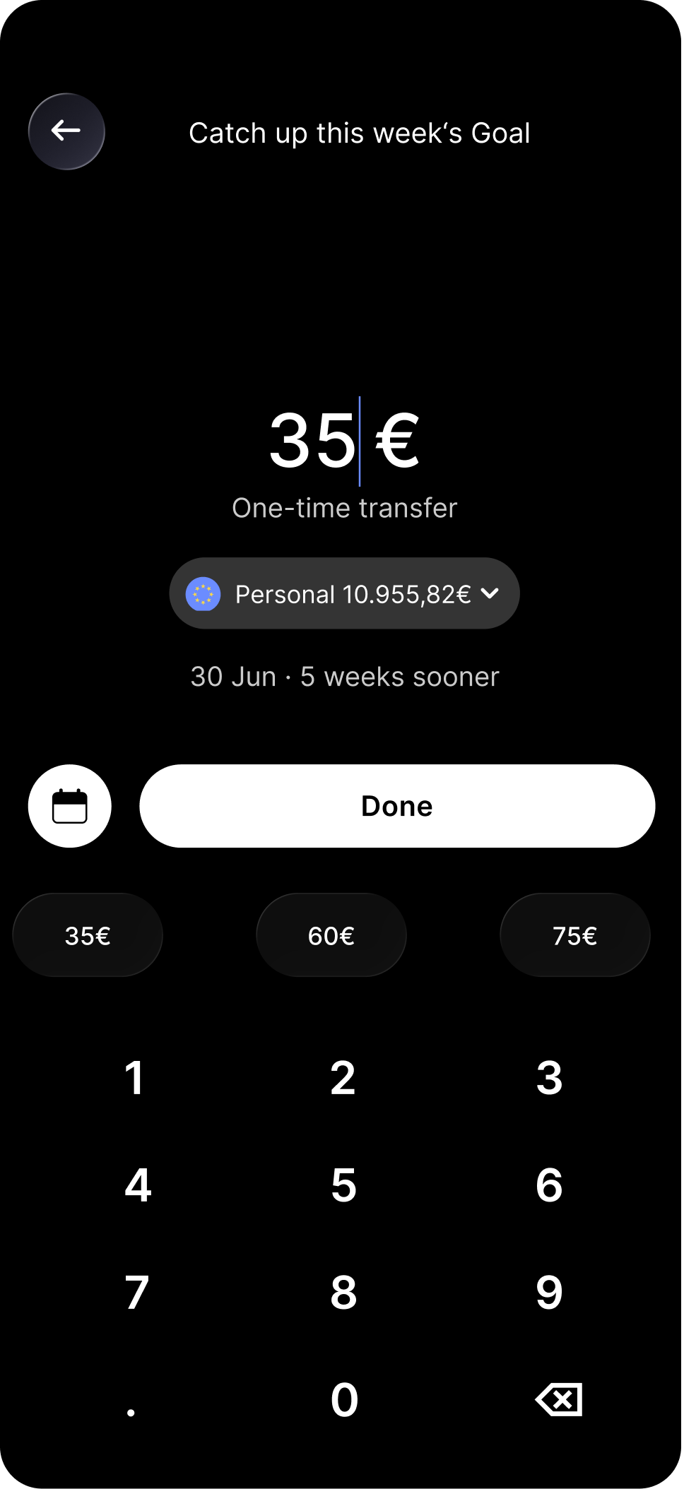
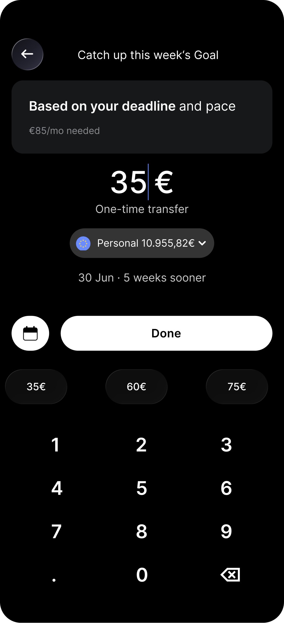
Falling behind is silent. We detect when saving slips below the needed pace, flag the Pocket as Behind, and give the exact number to fix it. One confirmation moves users back on track.

High impact
Feature 02 flow
03

Know exactly when you'll get there

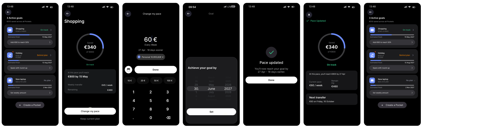
A progress ring shows how much you've saved, never when you'll arrive. We surface the projected date from the current pace, and a control lets users test a higher weekly amount and watch the date jump earlier before committing.

Low effort · High impact
Feature 03 flow
04

Always know your next move

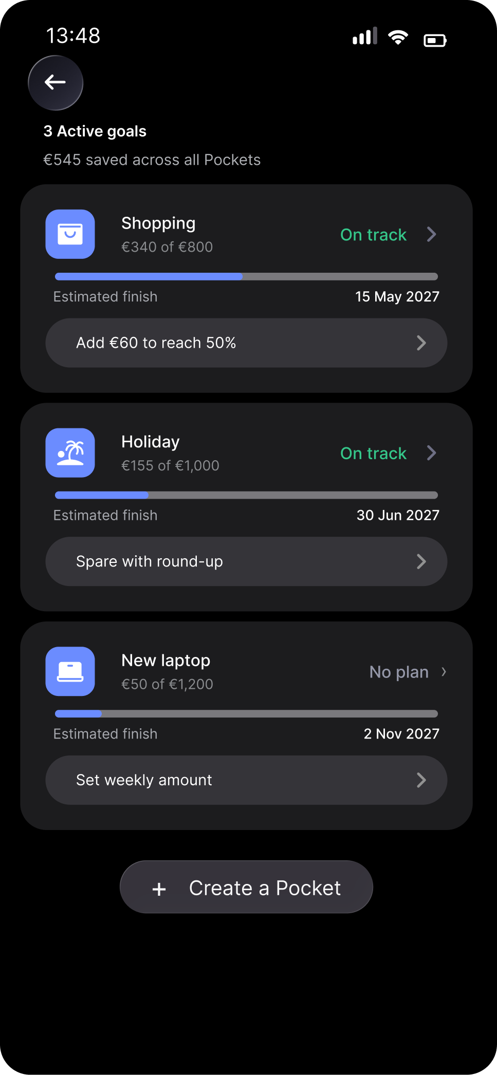
The list showed balances but never what to do. Every Pocket now surfaces one contextual action tuned to its state, act straight from the list, never zero, never a menu.

Low effort · High impact
Feature 04 flow
05

Turn spare change into steady progress

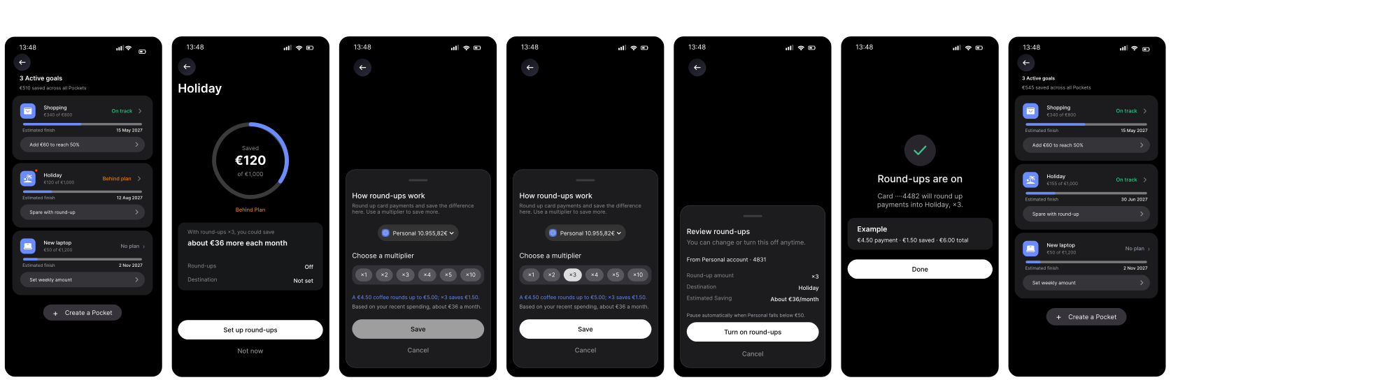
Every card payment became an opportunity to save. Users could round up purchases, assign the spare change to any Pocket, and multiply each contribution to accelerate progress without changing their spending habits.

Low effort · High impact
Feature 05 flow
06

Celebrate every milestone

Saving is a long, flat grind. Each goal is broken into 25 / 50 / 75 / 100% milestones, celebrating each one and nudging users toward the milestone within reach.

High impact
Usability test result

All tasks were completed, but the interaction data shows where guidance broke down.

100% task success did not mean a frictionless journey.

Success = task completed · Misclick = click outside the expected path
Task 01n=5

Create a holiday savings goal

0Task success
0Misclick rate
110.7sAvg. time

FindingUsers searched for where to start goal creation.

Task 02n=5

Plan regular contributions

0Task success
0Misclick rate
182.6sAvg. time

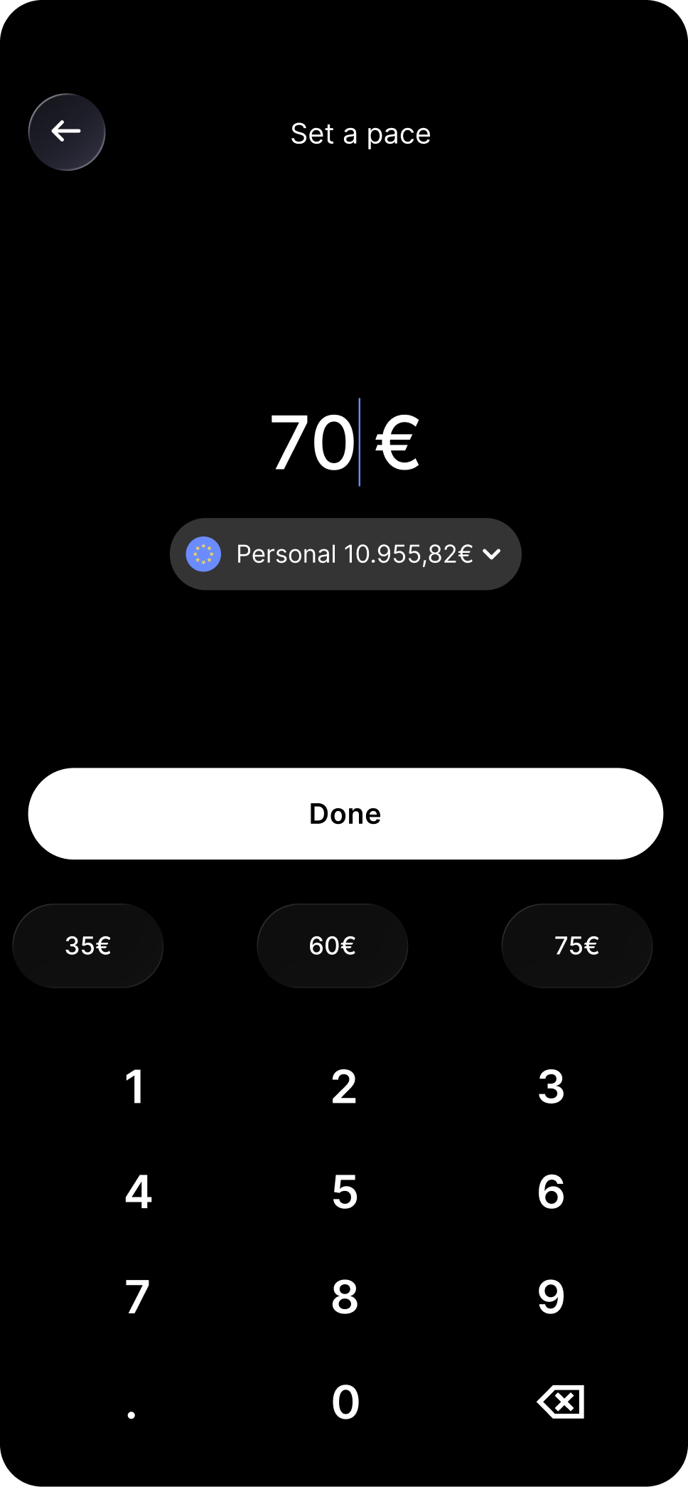
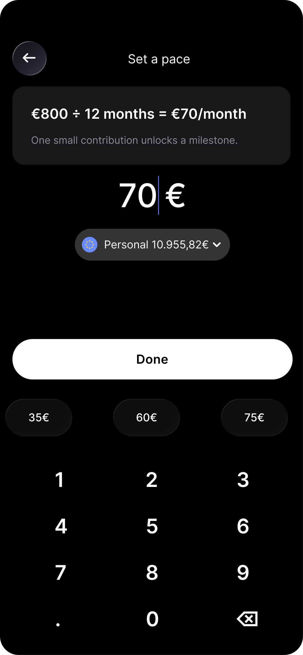
FindingThe source of the suggested €70 was unclear.

Task 03n=5

Get a goal back on track

0Task success
0Misclick rate
58.4sAvg. time

FindingThe reason for adding €35 was unexplained.

Task 04n=5

Save more with round-ups

0Task success
0Misclick rate
95.4sAvg. time

FindingThe Round-ups state caused uncertainty.

Prototype-test data · not live product analyticsTask success is listed separately from misclick rate

Entry point not visible, suggested amounts felt arbitrary

Driven by T1 (67.4% misclick · 110.7s) and T3 (57.8% misclick).

BeforeAfter

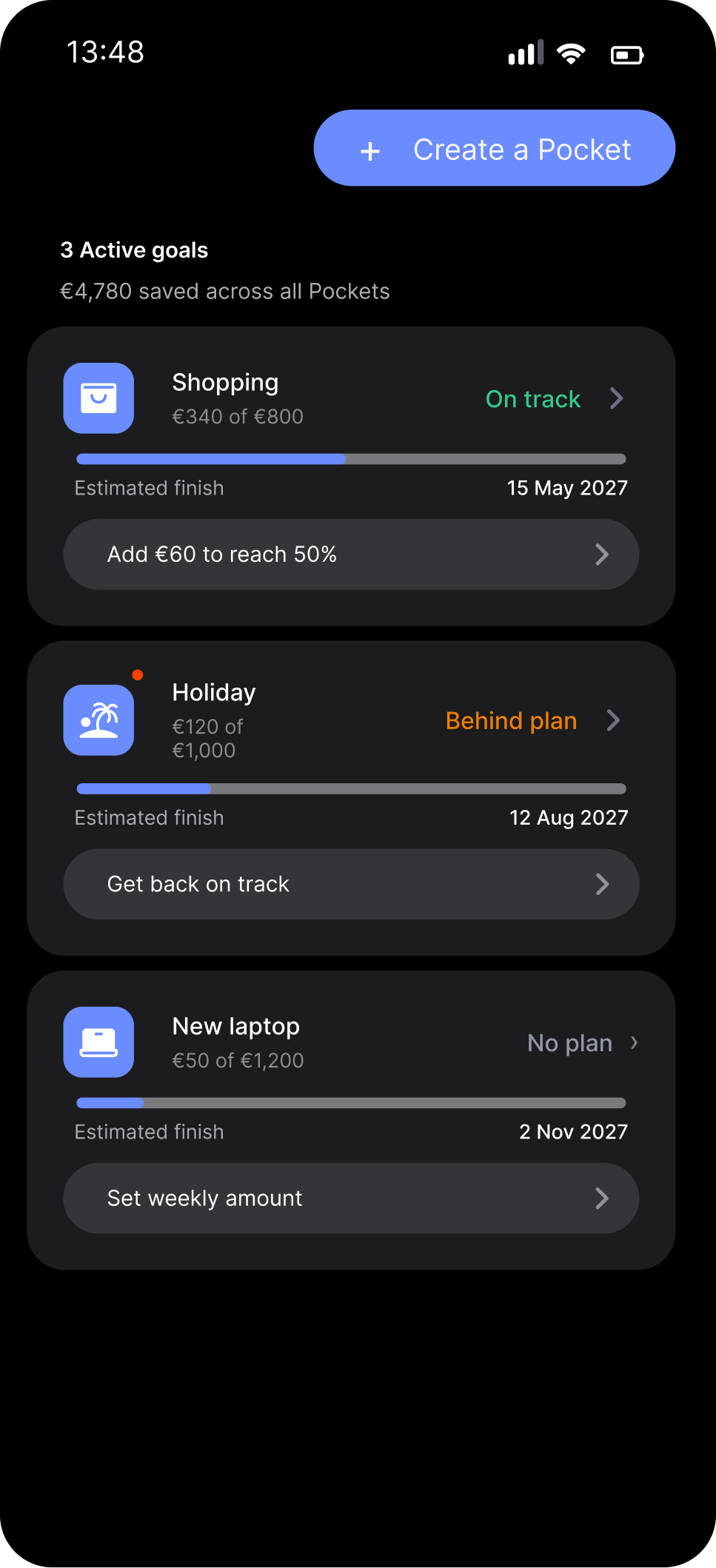
Where do I create a new goal?Entry point always visible

BeforeAfter

Why €35? Where does this come from?Source of number now clear

What changed

Added a persistent "+ New Pocket" button to the Pockets list header, always visible, no scrolling. Added one line above every suggested amount showing the source of the calculation.

Why it works

Recognition over recall: the entry point must be seen, not remembered. Showing the maths converts distrust into confidence in under a second. Visibility of system status: users need to know where a number comes from before they trust it.

Expected: misclick ↓ · time ↓ for T1 & T3

Auto top-up amount had no source shown, highest friction task

Driven by T2 (48.2% misclick · 182.6s), the worst-performing task.

BeforeAfter

Why €70? Is this right?State confirmed, no re-tap

What changed

Added one line of grey text directly above the pre-filled amount on the confirmation screen: "€800 ÷ 12 months = €70/month". The calculation is now visible before the user has to decide.

Why it works

Users don't distrust the number itself, they distrust numbers that appear with no source. T2 had the highest time (182.6s), so this single change is expected to be the highest-impact fix in the iteration.

Expected: time ↓ significantly · misclick ↓

Round-ups toggle state was ambiguous, users re-verified repeatedly

Driven by T4 (misclick 12%, but time 95.4s, slow despite easy navigation).

BeforeAfter

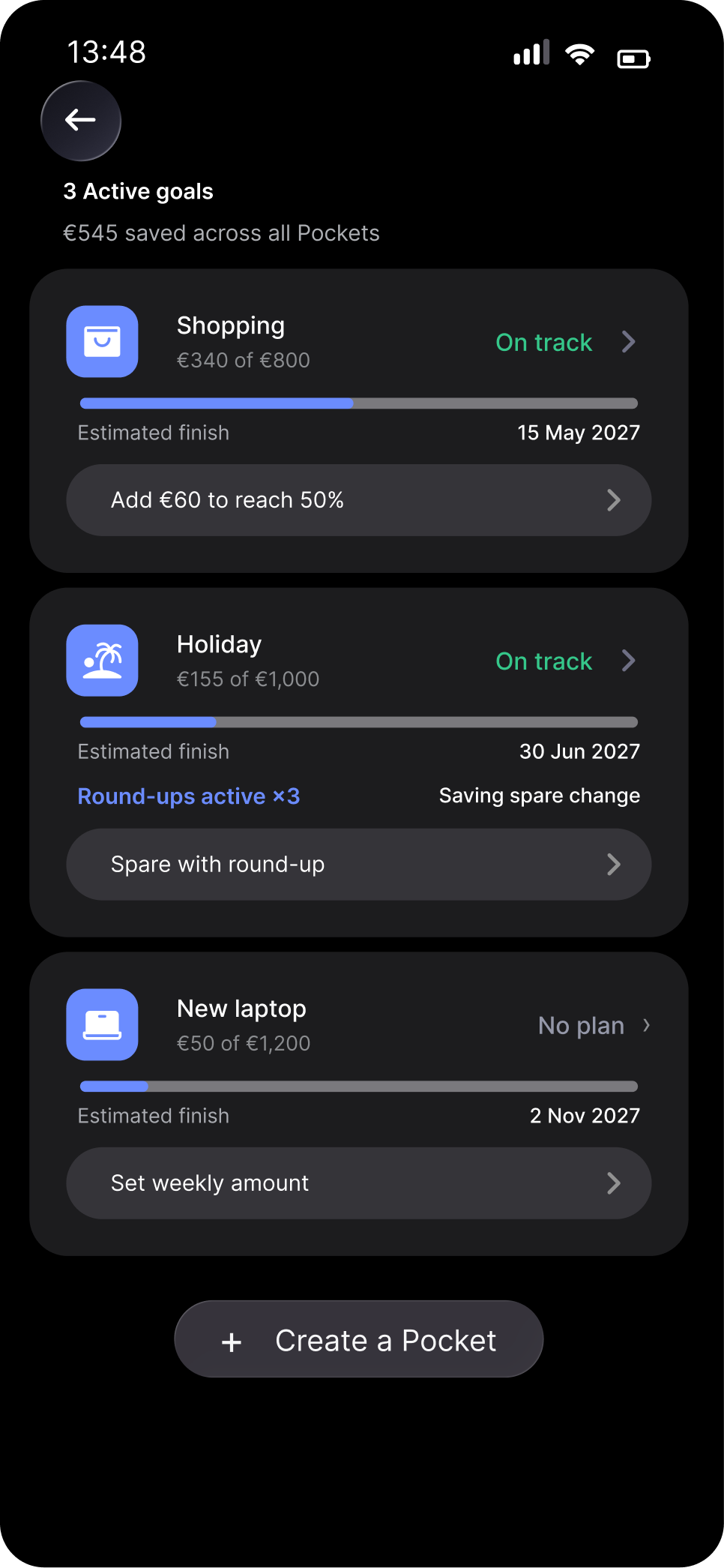
Returns to normal, no active indicatorPersistent active state on Pocket card

What changed

When users return to the Pockets list after enabling round-ups, the Holiday card now shows a persistent "Round-ups active · ×3" strip with the most recent save, the active state is visible without opening any settings.

Why it works

T4 had the lowest misclick rate (12%), users found the flow easily. The extra 95 seconds came entirely from re-verifying a setting that gave no visible confirmation. After a user takes an action, the interface must confirm what happened; silence reads as failure.

Expected: time ↓ · state confirmed at a glance, no re-verification

What I learned through this project.

The strongest outcome was a shift in how I evaluate success in financial products.

01

Completion is not the same as clarity

Success can still hide hesitation and low confidence.

Task success alone does not describe the quality of the experience.
02

Financial guidance must explain itself

Recommendations need a visible reason.

Users need to understand why an amount is suggested before they can trust it.
03

Confidence comes from transparency and control

Show impact while keeping choices editable.

Financial experiences should guide users without making decisions feel automatic or unexplained.
Core learning

Good financial guidance should explain decisions without taking control away from users.

Next project Elevio
✕ close